Google tests revamped Gmail interface
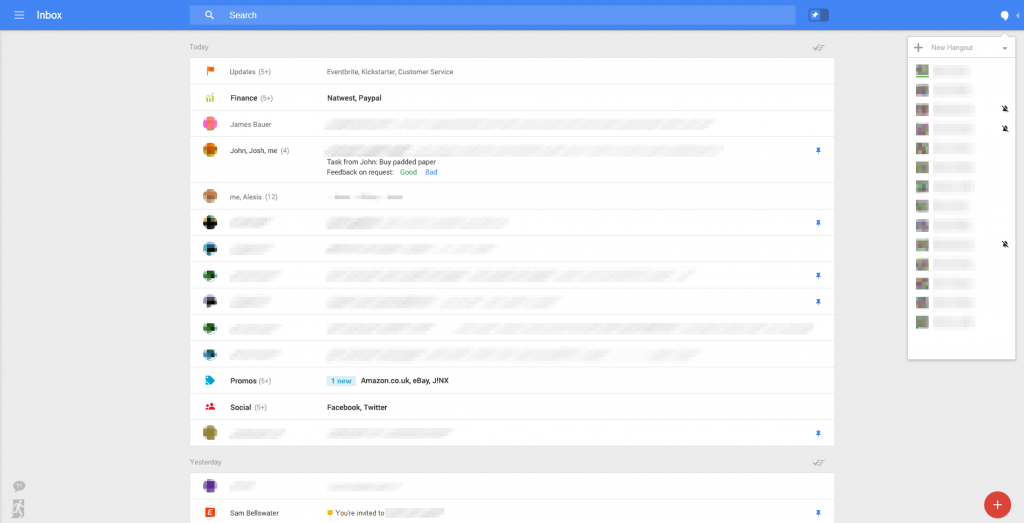
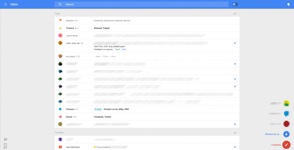
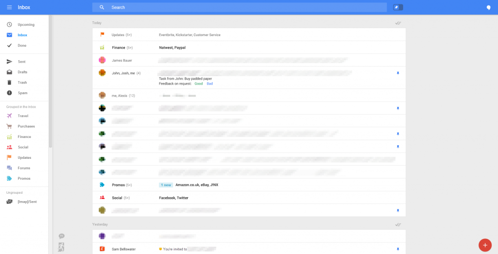
It’s weekend so there isn’t much going on; so I was surprised when I caught an article over at geek.com; it seems Google is experimenting with a totally different Gmail interface.As you can see from the screenshots, the interface is totally revamped. Gone are the tabs introduced last year (which, to be honest, I never quite liked; I had already created my filters about what goes where so I disabled them straight away) and we have the idea of pinning emails, which is a much more natural way of distinguishing important messages. On the left there is the fly in menu system, with a collapsible Hangouts menu on the right. On the bottom right, you can see the way to either compose a message, or to quickly glance at reminders.
Of course we cannot be certain if this is just a testbed of new interface designs, or if Google really plans such a radical change to the interface; according to the source, most of these new features will make the cut soon enough.
Source: geek.com
