Foursquare, phase two: new redesigned app out soon
Foursquare decided to change its strategy a while back, by splitting its app in two. Swarm was now the place you went to to check in to venues and get badges. So how about the original Foursquare application? Starting next week, it gets a total redesign.
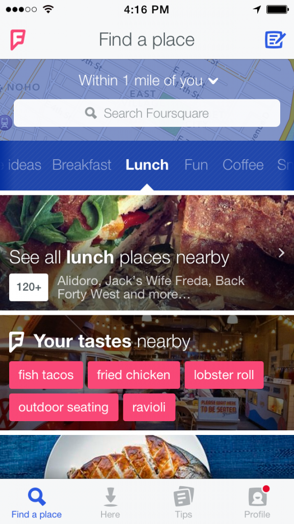
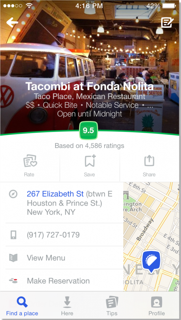
First of all, the company revamped the logo, trying to give it a more fresh look – whether they succeeded or not, it’s still debatable. Since the company first debuted, major players like Yelp, Google and even Facebook have entered the arena, so Foursquare needed to stay relevant; hence they decided to reinvent themselves. Swamp had a mixed reception when it arrived, with users complaining about crashes and usability, but they keep on improving it. “The check-in story has dominated the brand and user experience,” says Dennis Crowley, Foursquare’s CEO. “We’d hear people say ‘I had no idea I could use this app to search for places.’” So, the new Foursquare puts personalization front and center. Every piece of the new app that’s customized just for you, like your favorite foods served at nearby places, is accentuated in pink. Crowley calls Foursquare’s hyper-contextual recommendations “superpowers,” a theme that has become increasingly prominent within the company in recent years. Crowley repeats again and again that Foursquare should help you see through walls and find the best places instantly in a city across the world.
The all new application allows Foursquare to focus squarely on tailored recommendations, based on your habits and past checkins. It also allows them to experiment more, add new sections like “Most Popular this month” or “Hottest venues around your location” without worrying how or where to shoe-horn all these new features. It’s a bold step in order to keep the company relevant and growing, so we’ll see how that pans out next week when the application will fall into our hands.
Source and more info: The Verge

